
User experience (UX) design is the collection of activities that design teams do to ensure the users visiting their site have a positive experience. Designing a website with high UX is a key asset to every business because it is the way that the user connects with your business, so it is crucial to leave a first good impression. Every movement that the customer makes on your site from entering their personal information to making a purchase has to be as seamless as possible. Having a quality website should be the centerpiece of your digital marketing strategy. However, in order to have a modern website with great UX, you have to follow up on the newest digital trends in the industry. We have provided 12 ways on how to improve your website user experience and overcome any challenge that comes your way.
1. Add more White Space
White space is the region between design elements. Despite its name, white space does not have to be white, it can be in any color you prefer. White space is essential to great design. Adding more white space to your website will balance out the design elements and will make your website more readable.
Many clients will disagree with adding more white space because they consider it as wasted advertising space. There are a lot of different mindsets when it comes to adding more whitespace between designers and clients. To optimize your website for the best UX, your designers have to find what is most important to communicate to the users and then add the whitespace around the text.
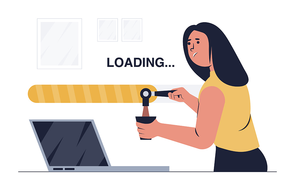
2. Improve your Page Speed
Users expect to get fast results for what they are searching for. One of the reasons for slow page speed is web design mistakes. The result is a higher bounce rate and lower average time spent on your website. The longer the users wait for information to appear the more they get frustrated and leave which has a negative effect on the overall user experience. The reasons for slow page load time can be different, but the most common is the heavy image size. You can use free online tools to compress the image size before loading your image on your webpage. Also, for evaluating the reasons for your site’s bounce rate you can use Google’s PageSpeed Insights. The conversion rates will increase with an optimum page load time between 0-4 seconds.
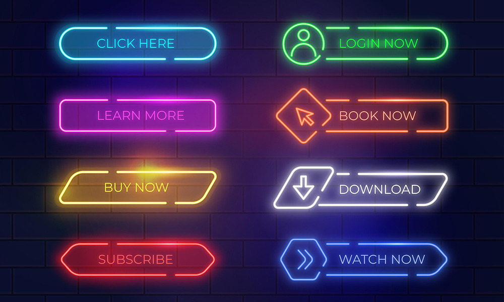
3. CTA Button
A call-to-action button is a marketing tactic that is a part of the interface design. Designers use different approaches when creating a CTA. Understanding your target audience’s psychology and preferences is the best way to get them to take an action. The entrance of your website should send a clear and simple message to encourage the user to take the wanted response. The longer the way to the CTA, the fewer users will click on the
A website with a lot of elements and distractions will most likely frustrate the user making the website untrustworthy and scare the users away. Great content is the key to invoking the users to take positive action. Showcasing the advantages in the content and providing all the needed information that will guide them to the target action is especially important for a positive user response. A successful CTA is a combination of market research, comprehensive offer, and great design.
4. Link visualization
Underlining the links is one of the most recognizable since the dawn of the internet. To achieve the best click rate you have to make sure the inserted links are colored and underlined. In most cases, designers tend to use the blue color to differentiate the link, but other colors are also commonly used. The anchor text has to be descriptive and easily scannable because it directs the customers to the next step. Pay attention to the length of the anchor text and fill in your target keywords. Google sees the anchor text as additional information about the insight of the page.
5. Insert bullet points
Bullet points help long and complex texts easier to comprehend by making the key points stand out. Web readers seem to be more interested in reading bulleted texts instead of inline lists because they can get to the point of interest way faster. It is less common for users to read sentences word-by-word, so it’s best for the UX to apply scannable text, so the readers can pick up what they want to read.
6. Use imagery
Using quality graphics is key for standing out from your competition. Applying custom images speaks about your brand’s originality and increases users’ trust. Leaving a good first impression is the most important part of determining whether a customer stays on your page. Users can easily differentiate stock imagery that they have seen before. That is why you should apply your custom brand images to form a connection with your audience.
7. User-friendly headings
Effective headings need to be easily recognizable at the first glance. An effective heading also has to be descriptive and visually appealing. A clear heading description will help the readers understand the flow of the content. Apply different font sizes and warm colors to point out the most important information from the text and also present it to the reader in a visually appealing way.
8. Consistency is key for UX
Consistency is the most important thing for a user-friendly design. Applying the same design to all the web pages ensures the user that he should continue reading your site. Consistency should be applied in the content, design, and interactions. To enforce a consistent UI experience across all your website you can simply follow the UI guidelines.
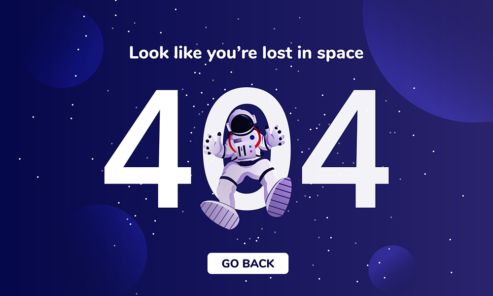
9. Make 404 pages more creative
It is a known fact that a 404 error is the most frustrating thing that a user can land into. However, it should not be a total UX disaster. Adding an interesting design to a 404 landing page can have a positive effect on the UX. The 404 landing page should have a clear explanation of what went wrong so the users don’t have to google it. You can check out these examples of creative 404 landing pages.
10. Make it Mobile Friendly
Making your website mobile-friendly is essential for user experience because the majority of online users spend more time on their mobile phones. The time that U.S. users spend on their mobile phones has reached an average of 5 hours per day. Optimizing your website to be mobile-friendly means making it easily accessible and simple for moving users that usually have a shorter attention span. You can check the potential revenue improvements of your mobile website by using the Impact Calculator.
The design must be tailored to fit the small screens of the mobile devices. When optimizing your page to be mobile-friendly you should make sure you present the most important information to the users. Easy and intuitive navigation is key to a mobile-friendly website.
11. Use UX surveys
UX surveys provide information about the experience of the users, whether they liked your product or not. Knowing what changes to implement and what elements to improve is crucial for a better user experience. Ensuring that your customers are getting what they need is the most important aspect of every business growth. Doing quarterly research is enough to know

Translate your content
Establishing communication with the customers in their native language increases the user experience of the website. Considering SaaS translation is essential for expanding your brand in the global marketplace.
12. Real User Monitoring
To deliver the quality UX you need to notify the developers about the issues that customers are having, so they can solve them on a code level. Real User Monitoring tools provide live insight into the behavior of your users. The increased visibility of the user’s behavior will help you pinpoint the front-end issues that impact the customers.